Page 177 - Maths Class 04
P. 177

Answer the following questions.

                 a.  In which years the number of tigers was equal ?

                 b.  How many tigers were there in the forest in year 2003 ?

                 c.  What was the increasing number of tigers during 2004 – 2006 ?
                 d.  What was the increasing number of tigers during 2004 – 2009 ?
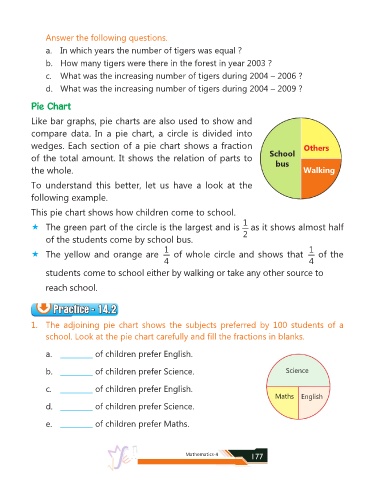

            Pie Chart

            Like bar graphs, pie charts are also used to show and

            compare  data.  In  a  pie  chart,  a  circle  is  divided  into

            wedges. Each section of a pie chart shows a fraction                                          Others
                                                                                              School
            of the total amount. It shows the relation of parts to
                                                                                                bus
            the whole.                                                                                    Walking

            To  understand  this  better,  let  us  have  a  look  at  the

            following example.

            This pie chart shows how children come to school.
                                                                                     1
            «  The green part of the circle is the largest and is    as it shows almost half
                                                                                     2
                 of the students come by school bus.
                                                          1                                                 1
            «  The yellow and orange are    of whole circle and shows that    of the
                                                          4                                                 4
                 students come to school either by walking or take any other source to

                 reach school.


                    Practice - 14.2
                    Practice - 14.2
                    Practice - 14.2
                    Practice - 14.2
            1.  The  adjoining  pie  chart  shows  the  subjects  preferred  by  100  students  of  a
                 school. Look at the pie chart carefully and fill the fractions in blanks.


                 a.  _________    of children prefer English.

                 b.  _________    of children prefer Science.                                       Science


                 c.  _________    of children prefer English.
                                                                                                Maths    English
                 d.  _________    of children prefer Science.


                 e.  _________    of children prefer Maths.


                                                                 Mathematics-4          177
   172   173   174   175   176   177   178   179   180   181   182